All of us have been confronted with a decision at work that has a lot of uncertainty surrounding it. Try as we might, we cannot always remove the clouds around the future before we make the decision. In situations like these, there is nobody that can make the decision with the best outcome every single time. The best that we can do is choose the pathway with the best expected outcome from the information available to us. But how do we find the best route forward? I have developed a process from myself taking heavy inspiration from Annie Duke’s book Thinking in Bets and Daniel Kahneman’s book Thinking, Fast and Slow as well as a few dozen academic papers on decision making that I did not bother to write down (they were less influential than the books).
This process consists of four steps:
Collect forecasts from team members in writing prior to meeting.
Compile forecasts into simple visuals depicting where the team stands on important issues.
Meet with the team to go over the results and learn why certain forecasts were made.
Make a decision.
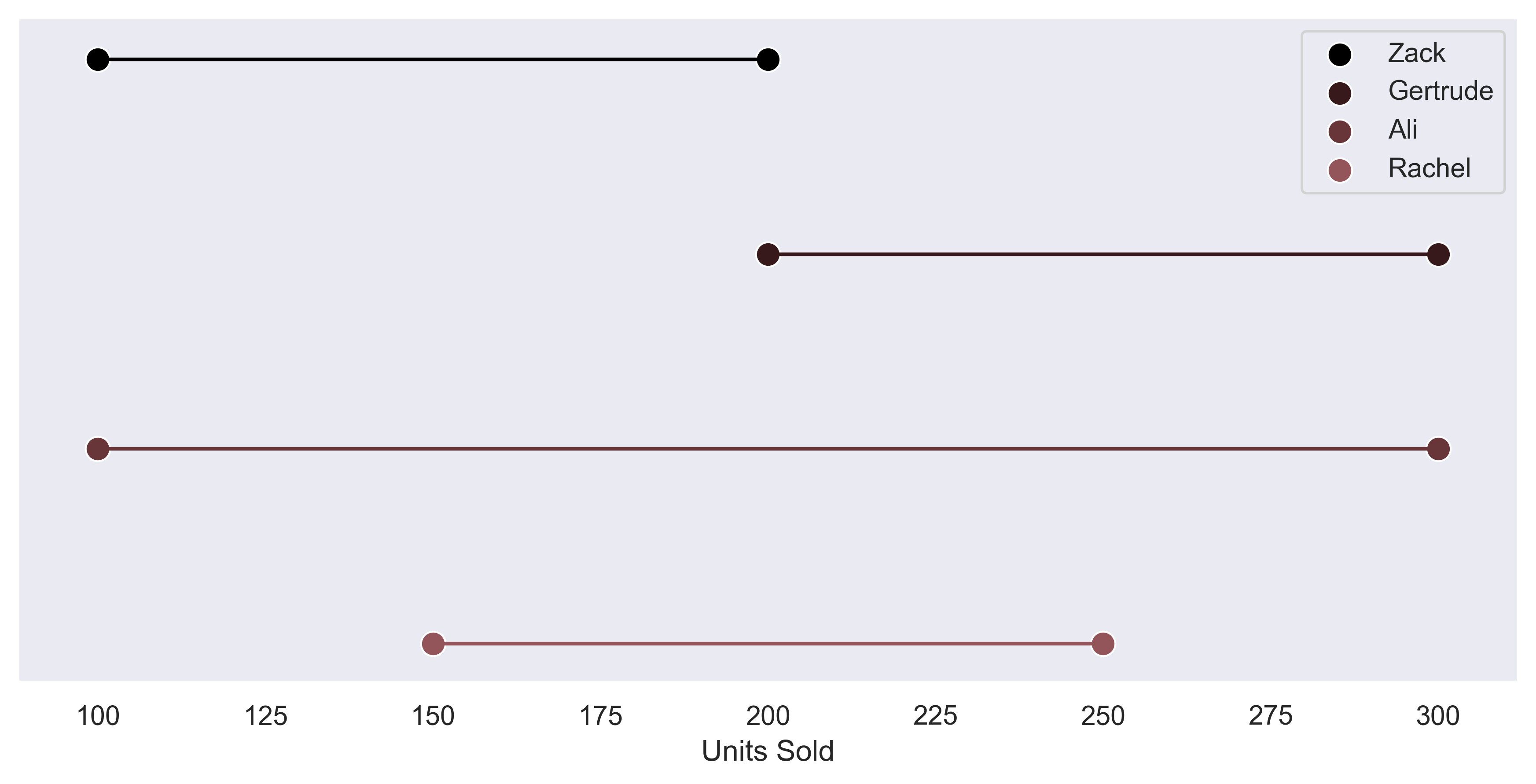
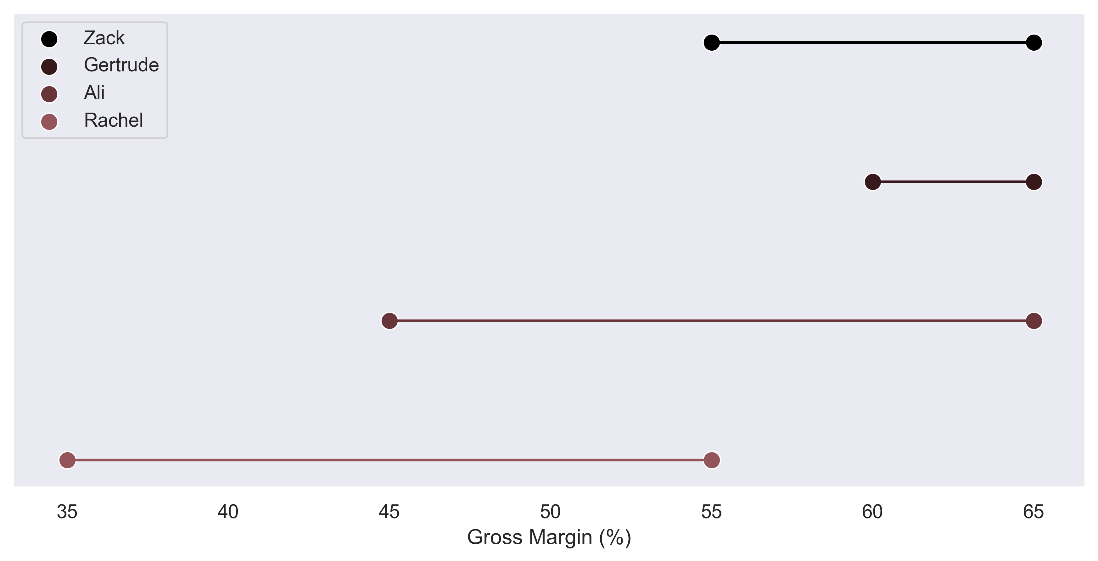
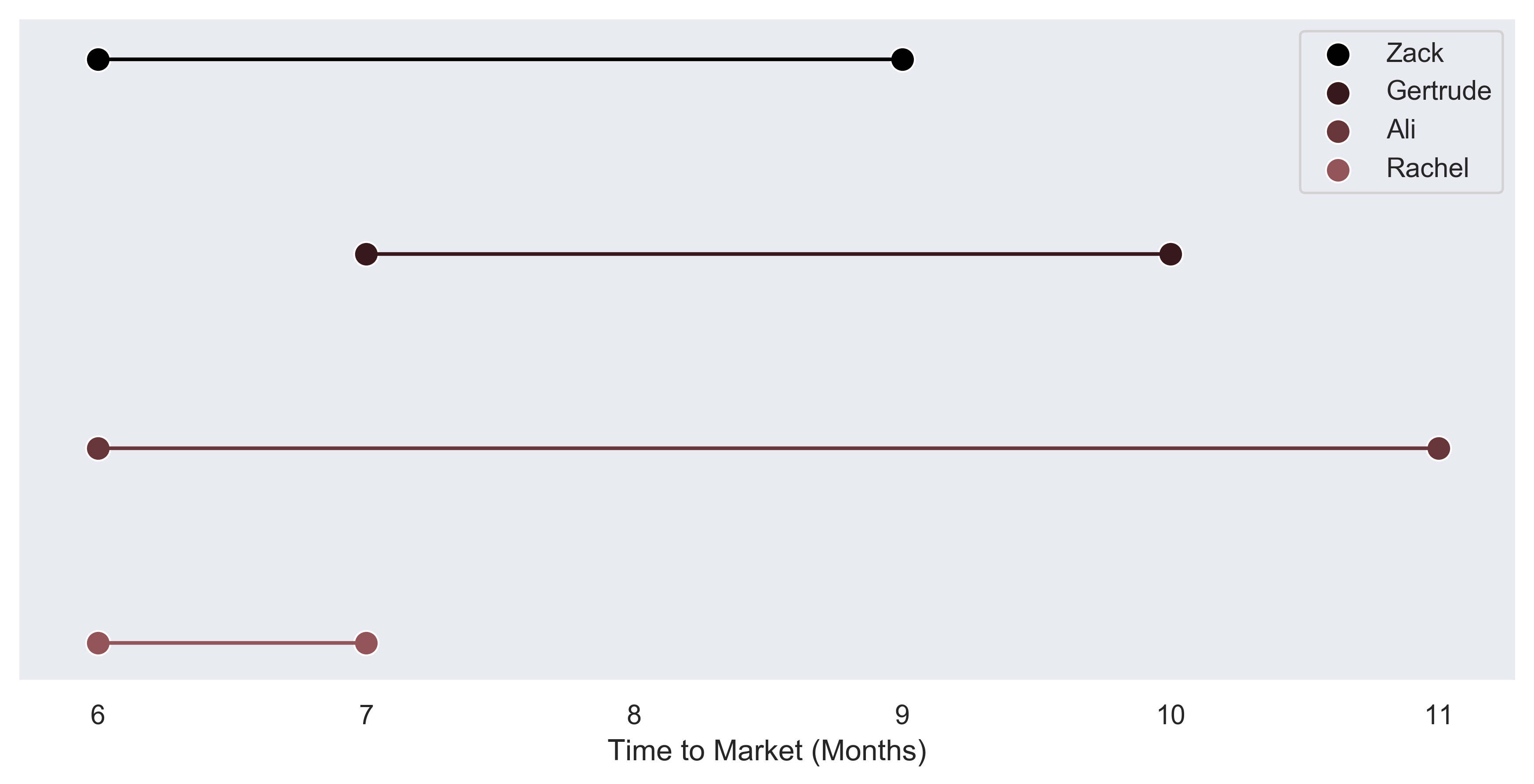
Below is an example of a ludicrously simple plot style I have generated to help myself gauge uncertain decisions with large consequences. This example is for a fictitious product development cycle that nobody on the team feels comfortable with any of the forecasts. By compiling everyone’s thoughts into one visual, the teams thinking can be understood.
The first plot is generated in Python3 with the code shown below. Seaborn is not necessary but it does help to spruce up the plot a bit. Aesthetics of plots can be critical to understanding them so investing the small amount of time to make plots look pretty can pay dividends down the road.
import matplotlib.pyplot as plt
import seaborn as sns

sns.set(style = 'dark')

labels = ['Zack', 'Gertrude', 'Ali', 'Rachel']
forecast = ((100,200),(200,300),(100,300),(150,250))

yAx = (-1,1)
ySpace = (yAx[1] - yAx[0]) / (len(labels+2))

with sns.cubehelix_palette(8, start=.9, rot=0, dark=0, light=.95, reverse=True):
  fig,ax = plt.subplots(1,1)

for i in range(len(labels)):
  y = yAx[1] - ySpace * i
  sns.scatterplot(forecast[i], (y,y), label = labels[i], ax = ax, s = 100 )
  sns.lineplot(forecast[i],(y,y))

ax.get_yaxis().set_ticks([])
ax.set(xlabel = 'Units Sold')
These plots serve three purposes:
It helps you to gather everyone’s thoughts without influencing their input. One common phenomena in a planning or brainstorming meeting is people not feeling comfortable sharing their opinion or having their opinion influenced by authority figures such as management.
Collecting everyone’s thoughts allows for you to make a decision that is not a consensus decision. Dissent is formalized and your thinking will automatically be challenged by collecting forecasts.
You have an easily understandable record of your decision making should anyone ask you to defend your decision. If your process is robust, dealing with the fallout from a poor result is much easier than if you decided to recklessly charge forward.
If you have any questions about this process please send me an email or a LinkedIn message from the bottom of the site!